When designing for the web, appearance isn’t just decoration—it’s a critical part of communication. In Module 6, we explored how typography, multimedia, and infographics shape the way users process content. I applied these concepts directly to my own webpage design, using both course principles and real-world examples to inform each decision.
Enhancing Typography for Clarity and Impact
To improve the visual hierarchy of my page, I bolded subheadings to 700 weight and increased their size. The main heading was inverted—white text on a black background—to demand attention and serve as a visual anchor. I also limited my font usage to two families for consistency. This echoes the approach used by Medium, which uses just two fonts (one serif, one sans-serif) to balance readability and elegance. Limiting font variation reduces cognitive load, enhances brand cohesion, and aligns with best practices in digital design (Tate, 2019, Chapter 6).
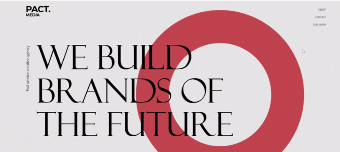
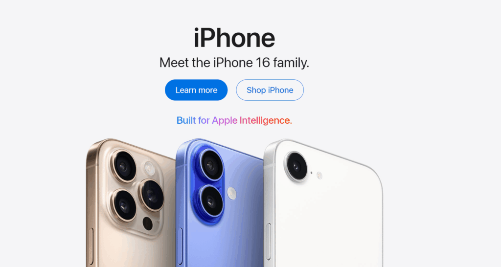
These are common typographic strategies used by websites like Apple, which relies on large, high-contrast headers with minimal text to guide users through clean, modular content zones. These changes align with the principles of visual hierarchy, which guide the viewer’s eye using font size, weight, and placement (Tate, 2019, Chapter 6). This small formatting change helps orient the user and improves scanability—key elements of effective web design (Tate, 2019, Chapter 6).
Adding Multimedia for Engagement
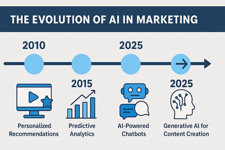
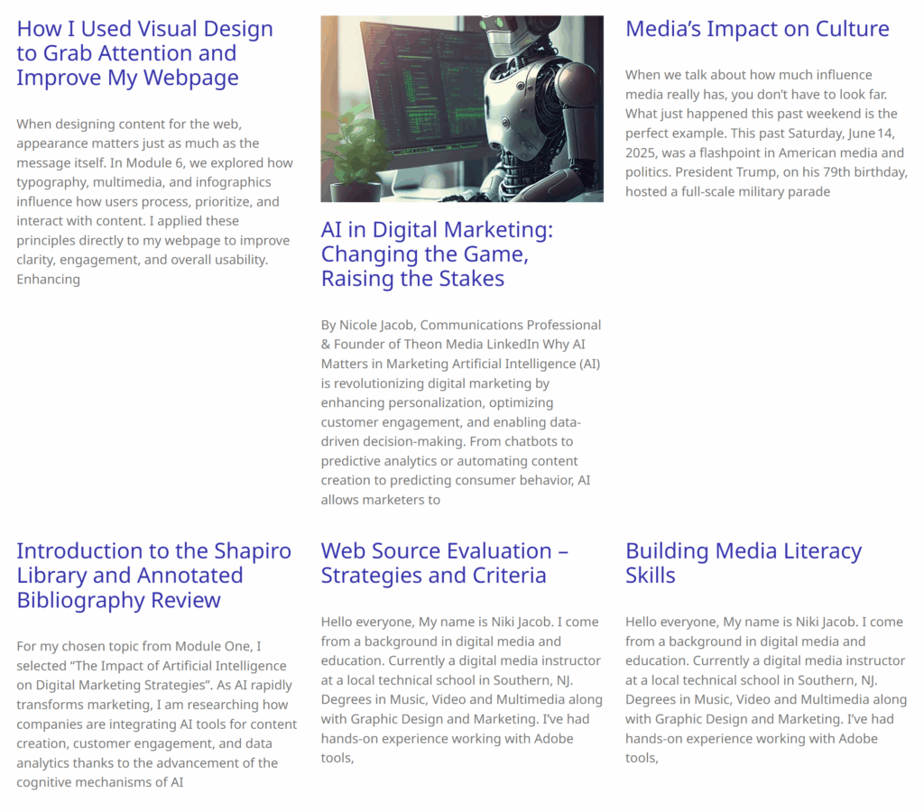
Research shows that users retain 65% of information paired with relevant images, compared to only 10% from text alone (Weinreich et al., 2023). Multimedia like these elements enhance comprehension and can also increase time spent on a page (Kaliski, 2023). I incorporated an AI timeline infographic (2010–2025) in the center of the webpage. This visual breaks up text and captures interest through color and structure. I also added a curated image to the bottom section, giving the page more visual balance and reinforcing the content theme.
Structuring the User Experience
Sites like Duolingo make similar use of multimedia. Their animated characters and colorful graphics guide users through content while keeping learning fun and engaging. According to research, users retain 65% of content when paired with images, compared to just 10% with text alone (Weinreich et al., 2023). By integrating media at strategic points, I improved information retention and encouraged users to scroll.
One of the most important updates I made to my webpage was adding a call to action (CTA) at the end of the post. The CTA encourages users to either keep reading or share the content on social media—simple, direct, and action-focused. This kind of prompt gives visitors a clear next step instead of letting the experience end passively.
Strong CTAs are essential in modern web design because they convert attention into engagement. On sites like HubSpot, CTAs are a core part of every content block—they often appear as bold buttons or highlighted sections that say things like “Download Now,” “Start Free Trial,” or “Learn More.” These aren’t just decorative; they’re designed to guide users further into the site’s content or funnel them toward conversion (Lachheb & Boling, 2023).

Research shows that users are more likely to engage when a clear directive is present, especially if it’s visually distinct and placed in a high-attention zone (Tate, 2019). My CTA is placed at the end of the article, following a natural Z-pattern layout, which ensures it’s one of the last—and most memorable—elements on the page.
Adding a CTA turned my webpage from an informative resource into an interactive experience, giving users a reason to act rather than just consume.
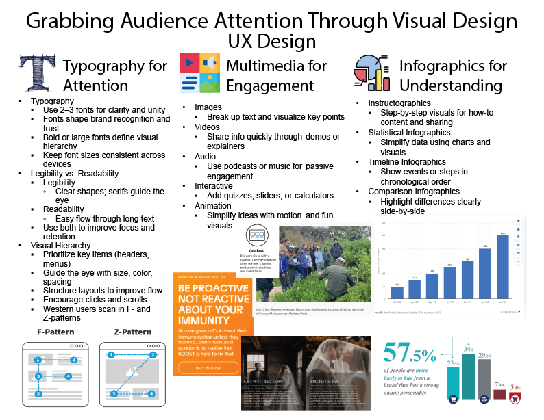
Infographics: Simplifying Complexity
The infographic I created for this project doesn’t just enhance the webpage—it serves as a design roadmap. Inspired by sites like Visual Capitalist, which uses data-driven infographics to break down complex economic concepts, I applied three core types of infographic design:
-
Instructographics (like those used by Statista) help users understand step-by-step tasks visually.
-
Timeline infographics (used by BBC Future) present events or processes in chronological order.
-
Comparison infographics (seen on Statista) highlight key differences with side-by-side visuals.
What is climate change_ A really simple guide. – BBC Future
These types of content reduce the burden of interpretation and help the viewer scan and retain critical ideas faster (Tate, 2019).
Structure and User Patterns
Finally, I based my layout choices on user behavior patterns. Western users often follow F-pattern or Z-pattern eye paths when reading online (Tate, 2019, p. 146). That’s why I positioned the image before the headline, then the headline left aligned under it. Using this method with or without images allows the reader to follow the natural scan path Z-pattern to maximize attention and action.
This is similar to how The New York Times structures articles: headline at the top left, images mid-article, and key links or related stories in the right of the page layout.
Final Thoughts
Redesigning my webpage with these visual design principles helped me better align content with user behavior and attention. Typography created structure. Multimedia added energy. Infographics simplified information. And real-world examples gave me a roadmap for what works. This assignment helped me see how strong digital communication goes beyond just writing—it’s about designing for attention, understanding, and action.
References
Kaliski, J. (2023). The psychology of content formats. Digital Media Studies Journal, 18(2), 89–93.
Lachheb, A., & Boling, E. (2023). Designing for web attention: Visual communication strategies. Journal of Web Design, 18(2), 123–130.
Tate, M. A. (2019). Web wisdom: How to evaluate and create information quality on the Web (3rd ed.). CRC Press.
Weinreich, H., Obendorf, H., Herder, E., & Mayer, M. (2023). Retention and recognition: Image vs. text in web design. Human–Computer Interaction Quarterly, 30(1), 105–118.
Apple. (2025). Apple. https://www.apple.com/
HubSpot. (2025). HubSpot. https://www.hubspot.com/
The New York Times. (2025). The New York Times. https://www.nytimes.com/
Duolingo. (2025). Duolingo. https://www.duolingo.com/
Statista. (2025). Statista. https://www.statista.com/